Tuesday, October 25, 2011
Friday, October 7, 2011

Thursday, October 6, 2011
We Got Lucky Drafts
Half Page Ad
 I used the previous template and sizing for the new ad. Was not able to fit one page of text into a half page ad with 10 logos at the bottom and a font treatment.
This still needs the editing for the contact info and RBC theatre information
Poster from Ad
 Managed to fit all the text in on this one (minus the edits for contact and RBC theatre address). Wanted to double check if this was really the direction we want to go with. Some slight text correction will be needed, and can be done rather quickly.

This still needs the editing for the contact info and RBC theatre information
Poster from Ad

Thursday, September 22, 2011

Sunday, July 3, 2011
Final poster for Sis
First one, made the changes you needed. Also added a design element of a ridge...for her pleasure of course....one the first one, the one you chose with the edited text on the second.
 and un-ridged.


Monday, June 20, 2011
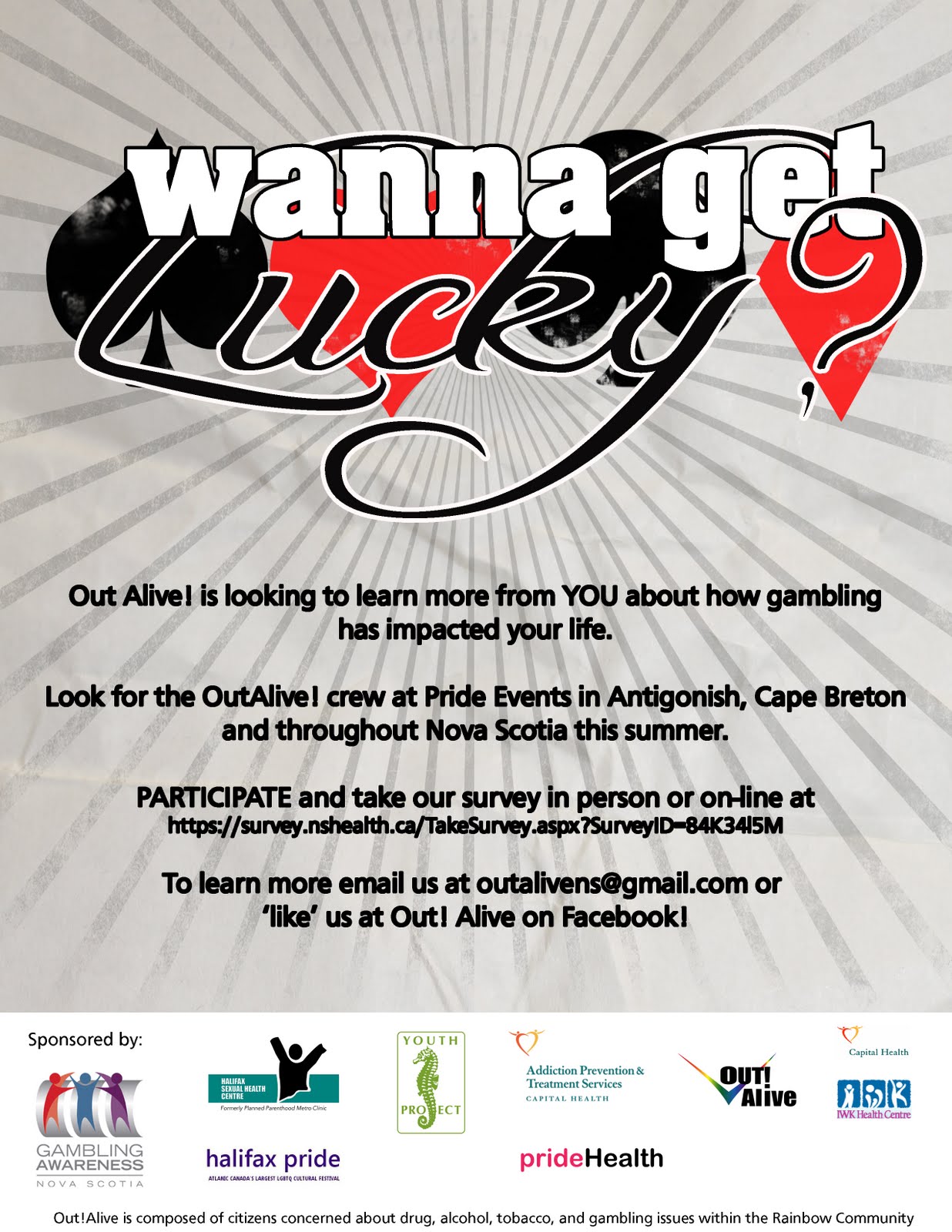
Final Edits as fo June 20th, for your review.
Please note: the survey link listed is NOT the final one. As such, DO NOT use these for print as of yet.
POSTER

BUSINESS CARD FRONT

BUSINESS CARD BACK

HALF PAGE AD (COLOUR)
![]()
![]()
RECTANGLE BUTTON FOR FACEBOOK LINKING
![]()

HALF PAGE AD (BLACK AND WHITE)

RECTANGLE BUTTON FOR FACEBOOK LINKING

Saturday, June 18, 2011
Poster and Business Card Updates for OUT! Alive


- removed "We need your help" and
- removed the words "in person"
- increased font size ( and added some colour to the text to pop out a bit more in one variation)

- added Halifax to list of pride events.
Friday, June 17, 2011
BUSINESS CARD SAMPLES
Here are some business cards as per the mock up that you sent me. I tried to fit in as many supporting groups in the back as I could, but there's only so much room for text.
I'm trying to play with a darker background to make it pop


Friday, June 10, 2011


Wednesday, June 8, 2011


Thursday, June 2, 2011
"What's the Deal with Gambling?" Variations for consideration
Taking the factors of the amount of text that was needed to be on the poster for the format, and the idea that this was to have something of a retro feel, I've combined them into these roughs for you to take a look over.
Each of these can be converted to business cards with a little work and can the final choice can be changed to an ad/flyer with just a little bit of work.
Variation 1- Rough concept
 Refined a wee bit, finding the yellow bands a bit distracting.

Merged style experiment

Variation 2
 Darkened up the text..
 Third variation
 And a final Fourth variation.

Each of these can be converted to business cards with a little work and can the final choice can be changed to an ad/flyer with just a little bit of work.
Variation 1- Rough concept


Merged style experiment

Variation 2


Tuesday, May 10, 2011


Monday, February 14, 2011

Subscribe to:
Posts (Atom)